Tuesday, August 24, 2010
Final Design

Proposal Two
I was imagining a stylish, metro sexual, young guy, map maker by day graphic designer by night. This studio is as much a social place to him as well as a place of work, given it’s vicinity to Sydney’s night life.
Initially the downstairs area was centred around a large T intersection that ran through the house from one courtyard to another on the north and south sides. This was accessed via a skinny corridor that created space at the front of the house for the kitchen and bathroom. The other side of this living area, was a large exhibition space.
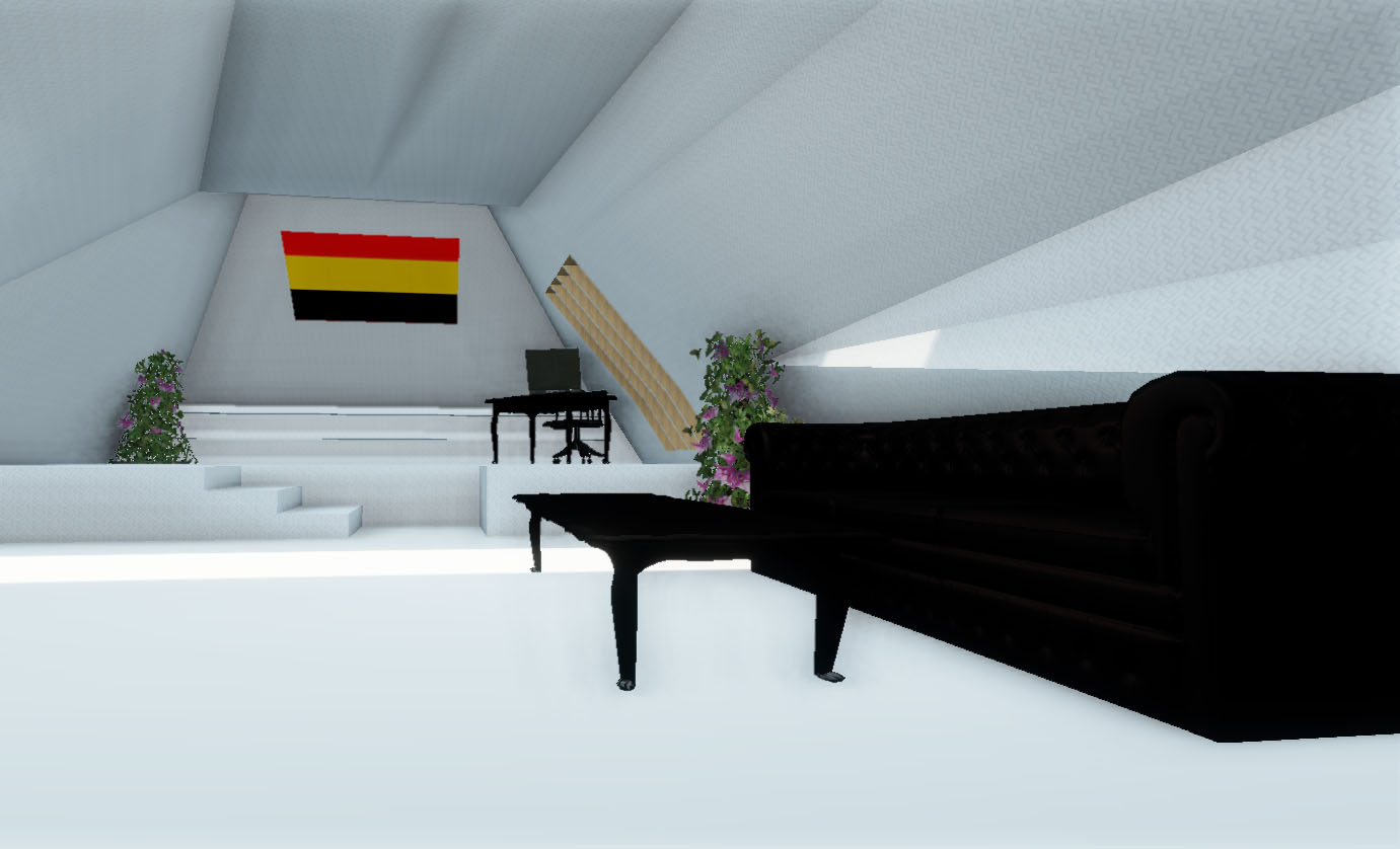
Similar, to my first design the map maker’s personal studio was quite distinct from the social area downstairs. Access was via a set of stairs, at the entry to the building. The double ceiling height of the living area below, meant that he could look down past the maps hanging from the ceiling. His large work area, had one wall for display and one with 3.5m high bookshelves, accessible by ladders. It then opened up on to a very private back yard.
I really liked the Mies’ inspired qualities that this design included with it’s multiple courtyards, inspired by the Barcelona Pavilion and the variety of spaces created by simple walls. However, when I built the lower floor plan up in sketchup it felt incredibly claustrophobic! I decided I needed to move the bathroom and kitchen and open up the living space. However, given that I was quite attached to the idea of a large T living space and the idea of artfully hanging maps I needed a plan that would maintain these elements within my desired shell.
I went through a lot of tracing paper fiddling with different layouts. Ultimately, I decided to take Mies’ love of courtyards further and also to take his direction on the placement of the bathroom, offsetting it from the rest of the building.
I then, rebuilt this up in sketchup and found that the street view was incredibly imposing. I found inspiration to solve this problem in Peter Zomthor’s building Kolumbia. I embellished that facades with brick detailing, a feature that I think would also be very interesting inside.

Another area for which I sort inspiration was creating an architectural public space. I really loved the feel of the following images and embraced the concepts of the designs within my own.
Proposal One
The office space, depicted in the perspective below, is surrounded by bookcases. It has a sloping roof and large pull back doors that open the space to an outdoor courtyard that looks over the park.
Although, I enjoyed developing this design I did decide to pursue it as I did not really feel it had a Mies quality. Although it embraced the open plan of many of Mies’ buildings I think that the extent of the openness, which was necessary given the special requirements did not create a variety of different areas, rather to distinct areas.
Site Analysis
Wednesday, June 16, 2010
File Links
Google:
Note: I uploaded it to google wharehouse white as the phototextures which covered most of the design made it quite large.
Monday, June 14, 2010
Final Design


Miranda Kerr and Angela Merkel are powerful women within the modern world. Within the sturdy construction of the suspension bridge, the main walking path represents their strength. The ornament of copper is intentional as the metal is heavly associated with the symbol of Venus, which itself is a symbol of women's power. Furthermore, through the long cuts taken out along alternate sides of the bridge the volatile nature of power is represented as the person must take care not to fall off the edge. The additional cuts between the offices of Merkel and Kerr represent the professional chasm that should be present between these two types of power being celebrity and Government. Through the windows along the corresponding sides of their offices it is recognised that they operate within the same society and are constantly observing eachother. In the meeting place, these two parties are given the opportunity to benefit from eachother within a social context hence the bar design.

The bar structure located at the base of the valley is constructed out of a series of circle sections. The circle is the oldest symbol associated with power. Through the multiple layers the many aspects of power are represented. This is similar to the ideas present within the bar. The different segments again represent the different elements of power, which is quite fitting as it is the meeting place for two different forms of power derived from different source being brains and beauty.

Final Textures
Initially I intended to use incredibly bright colours, a mixture of hot pink, red and orange for Kerr's kidney bean and a scheme of green, aqua and bright blue for Merkel (pictures where lost on my hardrive). However, as discussed previously I found a product that was advertised in InDesign very inspirational. It then drew me to a design for a hotel in Canada that I had previously admired. I think the combination of the strict shapes and the refined natural materials within this design create a very interesting aesthetic.