Monday, October 18, 2010

Communications - Re-Representing Representations

Initial Sketching

My initial impression of the site was not very inspiring. I believe that many architects will often place a sculpture in a place where they cannot develop the architecture sufficiently. The site is like a cavenous, lifeless hole between two pieces of architecture. Ben and I decided to focus on the lighting and the way it moves through the space. Due to the shadow cast by the neighbouring buildings the area between them is a vacuum of light.


Final Model

After developing this idea with reference to artists such as Eliasson Olufson we decided to make the pair of models interactive and contradictory. The design we decided to construct was a cavenous shape carved out of layers of card. As inspired by the small model pictured above. By making one stagnate and the other dynamic the person viewing the piece is able to explore the impact they themselves have on the way that light falls. By making them out of two different materials, of different weights and colour we were trying to portray the difference between light and dark.


Shadow Casting

Once the object was completed I explored the shadows that it is able to cast. I chose the two that I have sketched below as they represent the different ways that people can feel about darkness. The first, has a similar shape to a pair of birds in flight. Many people see darkness as a source of freedom and solitude, an escape from the outside world at the end of each day. The second shadow casting looks similar to a vicious dog. Others, particularly children see darkness as scary, lonely and isolating.


Exploring the Model

After constructing the model I also began to realise the opportunity that the model had to create pieces of architecture within itself. Below are a few photographs that I have taken depicting some of the spaces that the model can create. I think that this space could operate in a really interesting way as a public place or art gallery.

Communications - Rendering

Discovering the House

Out of the four houses presented to us I decided to explore the Bauler Point House. I fell in love with its abnormal shape, the architect Fergus Scott's approach to the landscape and the attention he paid to design the building specifically for the client and her four year old son. Below are some images of my favourite aspects of the house.


(All photographs sourced from Habitus Magazine, October-December 2010, taken by Michael Nicholson, pg. 99-106)

Final Submission


I was quite happy with the finished product, particularly the ink detail within the house. However, I think that I could have brought more life into the house had I explored more types of rendering.

Monday, September 20, 2010

Communications - Drawing

Final Submission - Rose Seidler House

For this project I was heavily inspired by the time period in which the house was built. I think that the house exudes the style of the 50's. I adapted a 50's comic style to the needs of the assignment, using hatching techniques and layout ideas but decided not to include boarders.

Weekly Exercises

The weekly tasks provided us with a great opportunity to learn and develop new skills. I found that the perspective lessons where incredibly useful and really liked learning more about using graphite.

Cup

Perspective Task


University Perspective


Tonal Drawing


Placing the Seidler House on the Science Lawn

Tuesday, August 24, 2010

Final Design

Below are the plans and sections developed for my young, trendy map maker. I am really happy with the final design, as I believe that it fulfils the concept that I developed and contains a strong connection with the key elements of Mies' work as demonstrated in the Brick House and Barcelona Pavilion. I think that I have embraced the need of the client and the neighbourhood while keeping in tact the delicate site.


In my mind the key design features are the glass map display area and the clearly defined zones, including the T-shaped living/gallery space, the expansive studio and the public garden area. I think that the three storey, hanging may display area at the entrance would create and exciting welcome for a visitor to the studio. It is then through the combination of glass and purposefully placed walls that the downstairs living area, including two decks, is constructed and creates a path through to the more private gallery space. This space is opened up by the double storey roof to the right side of the room, which lets natural light in through small windows that open to the public garden allowing for neighbours to get glimpses of the map maker's work. As the right wall of the map maker's second storey studio is also glass, he is able to look down too. The studio also, comprises of a wall of book shelves and an adjustable desk that changes in size depending on his needs. This studio then opens to a lovely private yard with a tranquil long pond that stretches the length of the back of the property, past a wall into the public garden space which is lined with benches.


Proposal Two

This design was inspired by the townhouses that surround the site. I wanted to keep the skinny street frontage and modernise it! I was inspired by this picture that I found in a magazine.

I was imagining a stylish, metro sexual, young guy, map maker by day graphic designer by night. This studio is as much a social place to him as well as a place of work, given it’s vicinity to Sydney’s night life.

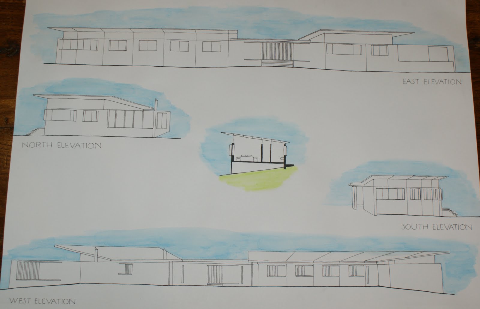
Initially the downstairs area was centred around a large T intersection that ran through the house from one courtyard to another on the north and south sides. This was accessed via a skinny corridor that created space at the front of the house for the kitchen and bathroom. The other side of this living area, was a large exhibition space.

Similar, to my first design the map maker’s personal studio was quite distinct from the social area downstairs. Access was via a set of stairs, at the entry to the building. The double ceiling height of the living area below, meant that he could look down past the maps hanging from the ceiling. His large work area, had one wall for display and one with 3.5m high bookshelves, accessible by ladders. It then opened up on to a very private back yard.

I really liked the Mies’ inspired qualities that this design included with it’s multiple courtyards, inspired by the Barcelona Pavilion and the variety of spaces created by simple walls. However, when I built the lower floor plan up in sketchup it felt incredibly claustrophobic! I decided I needed to move the bathroom and kitchen and open up the living space. However, given that I was quite attached to the idea of a large T living space and the idea of artfully hanging maps I needed a plan that would maintain these elements within my desired shell.

I went through a lot of tracing paper fiddling with different layouts. Ultimately, I decided to take Mies’ love of courtyards further and also to take his direction on the placement of the bathroom, offsetting it from the rest of the building.


I then, rebuilt this up in sketchup and found that the street view was incredibly imposing. I found inspiration to solve this problem in Peter Zomthor’s building Kolumbia. I embellished that facades with brick detailing, a feature that I think would also be very interesting inside.


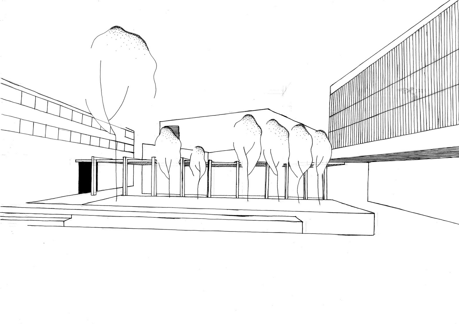
Another area for which I sort inspiration was creating an architectural public space. I really loved the feel of the following images and embraced the concepts of the designs within my own.