
File Front: http://www.filefront.com/16758221/Alex3188030Exp3.zip
Google:
Note: I uploaded it to google wharehouse white as the phototextures which covered most of the design made it quite large.
Wednesday, June 16, 2010
Monday, June 14, 2010
Final Design


Miranda Kerr and Angela Merkel are powerful women within the modern world. Within the sturdy construction of the suspension bridge, the main walking path represents their strength. The ornament of copper is intentional as the metal is heavly associated with the symbol of Venus, which itself is a symbol of women's power. Furthermore, through the long cuts taken out along alternate sides of the bridge the volatile nature of power is represented as the person must take care not to fall off the edge. The additional cuts between the offices of Merkel and Kerr represent the professional chasm that should be present between these two types of power being celebrity and Government. Through the windows along the corresponding sides of their offices it is recognised that they operate within the same society and are constantly observing eachother. In the meeting place, these two parties are given the opportunity to benefit from eachother within a social context hence the bar design.

The bar structure located at the base of the valley is constructed out of a series of circle sections. The circle is the oldest symbol associated with power. Through the multiple layers the many aspects of power are represented. This is similar to the ideas present within the bar. The different segments again represent the different elements of power, which is quite fitting as it is the meeting place for two different forms of power derived from different source being brains and beauty.

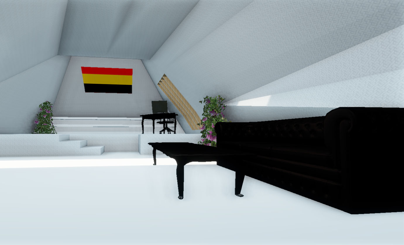
The two office spaces are intentionally similar but different. The exterior is consistent to comment on the inapporpriate value that society places on celebrity, keeping them in line with or more important than government. It is through the contradiction of the interior two office spaces that the concept behind the office is evident. Miranda Kerr's space is minamilist but showey in the colour scheme (hints of bright purple) and the seperating wall. Alternately, Angela Merkel's space is strictly minimalist, traiditonal and patriotic. These differences represent the contradicitions in their power. Kerr derives her power from modern consumerist society which over values celebrity and beauty. Merkel dervices her power from the strict tradition of government and her knowledge of politics. Please experience these spaces in the animations below.
Final Textures
 Initially I intended to use incredibly bright colours, a mixture of hot pink, red and orange for Kerr's kidney bean and a scheme of green, aqua and bright blue for Merkel (pictures where lost on my hardrive). However, as discussed previously I found a product that was advertised in InDesign very inspirational. It then drew me to a design for a hotel in Canada that I had previously admired. I think the combination of the strict shapes and the refined natural materials within this design create a very interesting aesthetic.
In my design I decided to use a combination of three varnishes on the exterior, bronze on the bridge and two of my own textures for the interior. I altered my own materials to suite the minimalist approach that I was trying to convey. I also photoshoped a photograph of Miranda Kerr to create a modernist piece of furniture.
Textures

I found the concept of capturing movement in a 2D form really interesting, it was also interesting the range of different techniques you could use to capture the essence of the same movement. I purposefully chose some really feminine words so that they would reflect well into my design.
Of the linear, my favourite are the fourth and fifth. In particular the lines of the fifth seem really strong and emotive.
My favourites within shudder are the first and the last. I really appreciate the simplicity of the last as it is still quite visually dynamic.
I found rotational to be the most inspiring word, yet it proposed a challenge to come up with something original. I really like my third and fifth texture. I love the subtle evolution within them.
I really like the last of the evaporate textures. I like the attempt I made at giving it a third dimension through hatching.
I love the word prance, it is so cute and feminine. I tried to capture that within these textures. I think the best are the second and the last. I really like the multiple textures within the second and how that balances with the white space.
Development of Bridge Ideas

Above are a selection of images sourced as inspiration (largely from archdaily), brainstorming and early sketches that I used and produced during the development stage of my design. I was intent on doing a mainly curved structure to challenge my sketchup ability and change rectilinear aesthetic I have maintained to date. Initially I planned on the bridge sitting atop the valley. However, as the design developed I decided to position the bridge within the valley. I then decided on the suspension cabels, the jelly shape and the office interiors. At first I was really keen on a very curved barbie aesthetic. However, as the design progressed I began to take a more natural approach to the textures. This was largely inspired by an ad in 'InDesign' magazine, which featured a product called 'Eveneer' (see below).

Lift


My lift design is intended to represent the 'prison of power'. Kerr and Merkel live their lives on the public stage. Constantly exposed to the judgement of other in their professional and personal lives, trapped and defined by public perception. It is through the prison like structure that I have tried to represnt this. As the old line goes power is both a gift and a curse.
Subscribe to:
Comments (Atom)